There are a number of traditional or classical project management tools which have held their popularity through the ages. This, despite having outlived their initial usefulness and utility over 75 years ago when:
- The world was less volatile, more stable, more certain, simpler and less ambiguous.
- The people doing the work were more compliant and considered faceless, interchangeable parts; doing the work unquestionably using their hands and back.
A couple of the most common go-to management tools I continue to see everywhere are:
- The Gantt chart
- The RACI chart
Since its introduction sometime between 1910 and 1915, creating a Gantt chart has given one the illusion of control and a false sense of predictability. As a former project management professional (PMP), it’s all good as long as the moon, stars and asteroids line up in a certain way. I’ve never, ever seen that happen, especially in this day and age – except perhaps once in a ‘blue moon’. Like the traditional Business Requirements Documents (BRDs), a Gantt chart is often out-of-date as soon as it’s published.
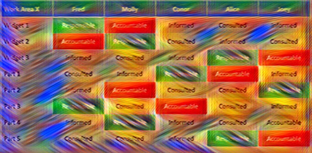
RACI Charts were first introduced in the 1950s. RACI stands for Responsible, Accountable, Consulted and Informed. A RACI chart is also known as:
- A Responsibility Attribution Matrix
- A Decision Rights Matrix
- Responsibility Charting
I have a particular abhorrence for the RACI chart. Here’s why:
- Its simplicity doesn’t mirror reality.
- It’s easy to complete yet, hard to use effectively.
- It’s one dimensional with low fidelity.
- It hides semantic differences and diversity.
- It’s pretty well useless in collaborative work environments beyond starting a conversation.
Let’s dive a little deeper into my reasons for hating on RACI charts.
Confirming or identifying people against single words like “Responsible”, “Accountable”, “Consulted” or “Informed” can appear to be a very straight-forward and easy exercise.
However, it’s like using labels to describe someone as
- “Extroverted” or “Introverted”
- “Bright” or “Dull”
- “Old-fashioned” or “Innovative”
Labels create biased stereotypes that often don’t tell the whole story about someone.
Likewise, filling in a RACI chart limits the exercise to just a single word that can hold a multitude of assumptions or expectations of that word at the same time for different people.
I’ve seen groups of people spend 15 mins to fill in a RACI, pat themselves on the back for an efficient meeting and declare victory as they adjourn early. And then, those same people spend the next several weeks and months complaining how so-so hasn’t been living up to their RACI chart agreement! It becomes a lightning rod for blaming people when things go wrong. The problem is that my interpretation of a RACI chart is not the same as your interpretation of the very same RACI chart.
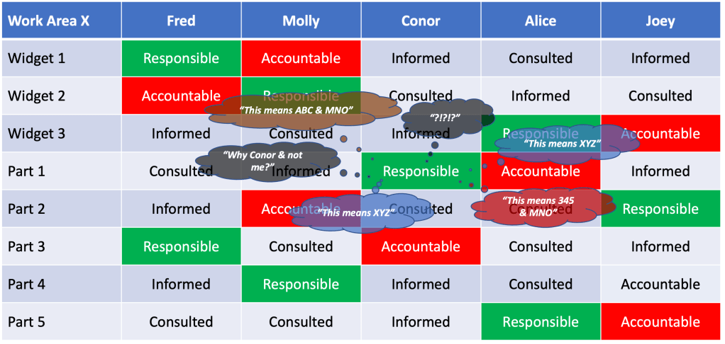
What if we were to think of the RACI chart as a User Story card? Just enough to invite a conversation but not enough detail on its own to align on every possible meaning or nuance of
- Responsible or
- Accountable or
- Consulted or
- Informed
So, while it might be fine to start with a RACI Chart, don’t stop there. Continue the ongoing conversation to co-develop and evolve a rich tapestry of collective, unique and clearer meaning and understanding behind each of the single RACI words.
Tap into and harness the undercurrent flow of subtext lurking just beneath the RACI surface.
Here are a few ideas on how to do that:
- Resist the temptation to box people in to RACI chart labels. So what if someone wants to be an ‘R’ sometimes and an ‘A’ at other times. Allow that person to voice their opinions so that everyone understands why before ruling it out. Perhaps in the process, you’ll realize that the specific focus area is too big and needs to be further broken down.
- Start with the semantics of what people do. Have everyone describe what they actually do and why they do it including any decisions they make. As people share, similarities and differences will take shape. In the end, a mosaic of RACI connections will result leading to opportunities for alignment, collaboration and learning.
- Enable empowered decision making and self-organizing teams. The only thing worst than a RACI chart is a top-down imposed RACI chart. Let the team decide how they want to divvy up their responsibilities. And while you’re at it, don’t limit them to old school RACI charts. Encourage them to experiment with other more progressive tools such as the Advice Process, Delegation Poker, or Team Alignment Map.
- Nurture and promote collective ownership of a team’s commitments. Whether it’s software code or customer experience, removing ownership boundaries welcomes and encourages people to contribute beyond their initial areas of focus. To help others and to ask for help. To acknowledge that the team is not done its commitments until everyone is done.
- Rotate roles and responsibilities on a regular basis. I love companies that start all new-hires with a stint in Customer Service. It’s the fastest way I know of to integrate new-hires into what the company’s purpose is and how it’s perceived by its most important stakeholder’s – its customers. If you don’t have first-hand knowledge of what your customers think of your company, how can you expect to improve their perceptions? Similarly, If you haven’t walked a mile in someone else’s shoes, how can you truly understand their role and responsibilities?
Whatever you do, don’t stop with a RACI chart and risk being misunderstood. After creating the initial RACI chart, open up the conversation for a RACI mosaic to emerge.