
When I look at the sprint burndown chart for some Scrum teams, I see a shape that resembles a hockey stick with shaft held horizontal and toe pointing down.
No work completing throughout most of the sprint and then a sudden flurry of completed work items during the last few days of the sprint as the team attempts to burn to zero work remaining.
I love my hockey stick but not with agile ways of working.
A sprint burndown chart is used by Scrum teams to track their progress throughout a sprint. It shows the amount of work that has been completed in a sprint, and the total work remaining to be done in the sprint backlog.
Additionally, burndown charts provide the following insights:
- How the scope of committed work changes throughout the sprint
- The likelihood of completing the committed work within the sprint’s time-box
- How effectively the team plans its sprint
Unfortunately, most nascent agile teams pay lip service to using burndown charts to guide how they work.
Here are some samples of real burndown charts from software teams using Microsoft Azure DevOps.
Each chart shows:
- Total Scope (Yellow-ish line)
- Ideal Burndown Trend (Green-ish line)
- Remaining work (Blue-ish line and area)


Interpreting burndown charts is kinda like reading tea leaves. Every burndown chart has a story to tell.
What’s the story being told by each of these charts?
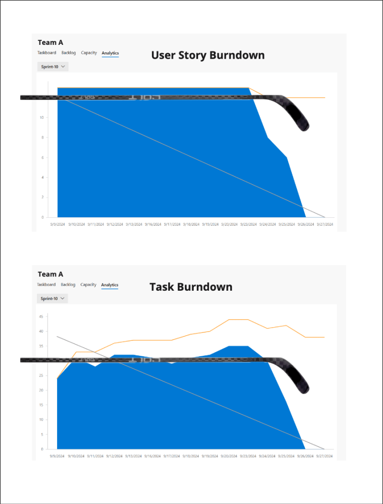
- The Classic Hockey Stick Burndown
- Were the stories too big?
- Were the tasks too big?
- Was there a focus on starting over finishing?
- Was the team having issues limiting and managing WIP
- How conscientious was the team in updating their ADO work items?
- How did the team’s capacity change over the course of the sprint?
- The Submarine Burndown
- A variation of the Hockey Stick Burndown except half the blade is missing
- Like a submarine once it submerges, there’s no way to tell how the team is progressing even if we look at the task burndown
- Unable to burn to zero as the submarine and its stories carries over to the next Sprint
- Were the stories too big?
- Tasks continued to be added throughout the Sprint
- Were the tasks too big?
- The (Almost) Ideal Burndown
- This is what “text book good” looks like – almost
- Most of the team’s User Stories are sized to complete well within a sprint
- Pace of completion is spread evenly through the Sprint
- These teams are focused on finishing existing work before starting new work
- In the spirit of the classic sales mantra “Always be closing”, burning down ideally means “Always be burning down”
- Why almost?
- Were a few of the stories too big?
- Was the work for those stories underestimated ?
- Did the team run into impediments towards the end preventing them from burning down to zero?
- Team C experienced scope creep towards the end of the Sprint
- Going Underwater
- When the user story burndown resembles a Submarine burndown with no discernible progress for several days, looking at the corresponding task burndown may reveal what’s happening under the surface of the water
- This is most effective when user stories have been broken down into tasks that last no longer than a day each
- Could the stories have been split further so that the submarine could surface more often?
- Deadline Mid Sprint
- This team had a deadline to meet half way through the Sprint with all hands on deck
- After the deadline passed…
- Was the pressure off to complete the rest of the stories?
- Did some team members begin taking time off to recover?
The stories told by these burndown charts have many unanswered questions deserving a conversation in order to appreciate the real story behind the charts.
Wanting to take a deeper dive, I was curious to see what results a Google search of “Burndown chart” would return.
Besides articles from the normal Agile tool vendors, one other search result caught my attention.
“What Is A Burndown Chart? Everything You Need to Know”
It wasn’t the title that caught my eye. What did catch my eye were two things:
- The article was published May, 2024 in Forbes – a mainstream magazine focused on world business and finance since 1917.
- The burndown chart SME quoted in the article was the Chief Technology and Innovation Officer at another mainstream institution – NASA Jet Propulsion Laboratory.
Both things being very much in the mainstream seem at odds with the current slowdown of the Agile economy.
A slowdown that is being felt by Agilists all over and at all levels, causing Agile ways of working to recede into the background on the fringes.
Hopefully talking about Agile ways of working in the mainstream is a positive sign for us Agilists 😀
